
Finding True North with Heatmaps
It’s old news that B2B marketers are using analytics to measure marketing performance. What we learn from analytics helps us optimize ROI and create more efficient, targeted campaigns.
But here’s an analytics headline worth noting: Smart Marketers are Hot onto Heatmaps.
Industry-leading marketers are upping their analytics game with tools that enable them to see exactly how visitors are using a site, a page, an ad or a campaign.
For some time, marketers have been using targeted analytics and link tracking to specify an audience, narrow ad distributions and track visitors use and interactions of pages. But these important analytic functions are no longer the only tools on the map. Let’s go off the grid and see how B2B marketers can use click, eye-tracking, and scroll heatmaps to visualize data that old standards like Google Analytics simply cannot supply.
Charting New Territory
Ask any passenger-seat navigator what the one drawback to a map is, and they’ll all tell you the same thing: folding the dang thing up. The concept of the GPS surely flourished in a moment of map-wadding fury.
Perhaps your marketing team has noticed that wringing meaning from traditional analytics can garner similar frustrations. Sometimes there is too much information, other times not enough. What seems significant can turn out to be petty, and something ostensibly inconsequential can end up being very important indeed.
Heatmaps are the GPS of analytics. They are guiding marketers to information destinations, hassle free!
Discovering The Best Route
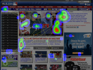
Click heatmaps allow marketers to see exactly what visitors are clicking on, whether it’s a button, a link, an image, or even text they expected to be a link. With click heatmaps, marketers can immediately see what’s working and what isn’t. For instance, they are able to determine something as granular as which “buy now” button visitors are clicking more.
Marketers are using eye-tracking heatmaps, which visualize mouse movements, to see where visitors are looking and identify which parts of the site they’re reading. Research indicates that mouse and eye movement are closely correlated.
Scroll heatmaps are being used to pinpoint how far visitors are scrolling down on a site’s pages. Marketers are using scroll heatmaps to find out how many visitors actually make it to the middle or bottom of the page. This information is used to determine where important content, such as a purchase button or a special discount banner, should be placed on the page.
Social Media Heads West
It should come as no surprise that B2B marketers are using heatmaps to analyze social media usage.

A brief look at the findings on the primary social platforms through the use of heatmaps illustrates just how effective these tools are:
Content matters. Facebook brand page visitors are immediately drawn most often to your posts, spending more time focused on these than any other element on the page. Keep brand content current and directed at your targeted audience in order to optimize the amount of time viewers dwell on your page.
Fixation Order is important. Heatmap analytics revealed a common ranking of what viewers look at first, most, and longest. Studies showed that visual attention beneath the fold drops dramatically, and that viewers are interested in who you are following and if anyone they know is following you. Pinning your best posts to the top of your page will help them get more attention.
It’s not the writing on the wall anymore—it’s the photos. Viewers of PlayStation’s Facebook wall proved that the wall with the most images is the wall people spend the most time viewing. A heatmap test of a number of brand pages revealed that, on average, viewers stayed on the image-heavy PlayStation wall for 4.88 seconds. No other page element on any brand’s page held attention for longer than four seconds. Studies have also shown that high quality embedded videos will promote return visits if they are fun, educational and under three minutes.
Tweeters read beneath the fold. Tweets have a much higher turnover rate than Facebook posts, Linkedin updates, and Google+ shares; so it’s no surprise that the most notable Twitter pattern revealed in heatmap studies is the extended reach of the viewer’s eye. Unlike on any other social platform, viewers commonly navigate far beyond the fold. It’s important to find the ideal schedule for your tweets keeping your brand visible in your follower’s feeds just enough, not too little, and not too much.
Higher content share rates, lower dwelling times. With a typical center page dwell time of 3.1 seconds before users move to take action by clicking on a link, user or image, the dwell time of users is significantly lower than on other social platforms. Research tweeting best practices and test often to discover the best ways to grab the attention of your targeted audiences.
Center-focused. In line with the other platforms, heatmap analytics showed that LinkedIn users spend a majority of their time in the middle of the page. From there, viewers tend to veer right to take some type of action, such as making a connection with another user.
Having a detailed page counts. The majority of viewer attention is focused on a page’s business information. As the number one lead generating platform for B2B marketing, it is important for brand pages to provide as much business information to users as possible. Since LinkedIn users are looking for business connections, make sure to provide a compelling reason why they should connect with you.
Dwell-time winners. With an average dwell time of 5.9 seconds, Google+ has the longest dwell time across all social platforms. Heatmap studies showed viewers generally pay the most attention to taglines and primary posts. High interest in followers. Similar to Facebook, viewers demonstrate high interest in a page’s followers, both who the page is following and who is following the page.
Lessons Learned from the Heatmap Pioneers
Readers stay above the fold. Viewers do scroll, but their attention span is short. A recent scroll study found that page viewing time decreases sharply when viewers go below the fold—80% of viewing time is focused on the content above the fold.
Recommendation: Place important and relevant content at the top of the page.
What consumers see is what they buy. When the decision process is rushed, visual impact influences choices more than consumer preferences. So when viewers are in a hurry, their focus is less on personal preferences and more on what sticks out on the page.
Recommendation: Optimize the design of your website so visitors can find what they are looking for (or what you want to sell the most) in an increasingly hasty world.
Viewers veer left. Several heatmap studies have shown that the left side of the website gets up to 69% of the viewer’s attention and time. The same studies indicate that the left side is also looked at first.
Recommendation: There are always exceptions, but keeping the left side in mind first is a good starting point.
Readers scan content in an F-shaped pattern. Strange as this sounds, it’s true. Think about it. Most people skim content, and their main focus is on the start of the text. We read the most important headlines and subheadlines, but only selectively read the larger parts of the text.
Recommendation: Make sure your headlines and subheadlines are strong and attention grabbing. The first two paragraphs must state the most important information in your text, because this is the content most likely to be read.
NOTE: this does not hold true when browsing picture-based webpages where people tend to browse in a horizontal manner.
Consumers ignore ads. Consumers are bombarded daily by thousands of ads, and people have learned to ignore advertising on websites. We call that defense mechanism Banner Blindness—subconsciously or consciously ignoring any block of text or images that may look like advertising.
Recommendation: Avoid (like the plague) any page designs that feature content in patterns that resemble ads or banners. If you don’t, your viewers will.
Consumers care what people look like, and what they look at. We don’t have to tell B2B marketers that buyers are swayed by a pretty face. But it might surprise you to know that several heatmap studies have shown that viewers follow the direction of a model’s eyes.
Recommendation: A pretty face looking at your content will encourage viewers to view your content. So put that beautiful person on your website, and make sure her eyes are on your content.
A Hitchhiker’s Guide to Heatmaps
Maybe your B2B marketing team was on the cutting edge of heatmaps analytics. And if you were, we thank you. But if you haven’t caught on to heatmaps yet (and this article has convinced you to hitch up your wagon and head out west), here are a few quick tips for reading, running, and understanding heatmaps:
- The lack of a heat pattern indicates confusion
- Heavy heat in an area of little importance tells you it is time for a redesign
- Minimize unnecessary noise in areas not receiving as much heat as you would like
- Track eye path patterns to merge the habits of your viewers and the desired design
- Especially useful with beautifully designed pages that aren’t generating traffic
- These are the most common eye path issues that harm conversion rates:
- Objects are competing for viewer attention
- Elements of the page are out of order
- There is too much “stuff” on the page
- Calls to action fail to call anyone to take action
On the Road to Marketing Success
So there you have it. Heatmaps are generating new analytics and adding a depth of understanding to some things marketers already knew. Don’t be the navigator who stuffs a mangled map into the glove box and ends up taking “the long way” to the analytics party. Take the direct route to measuring B2B marketing performance by adding heatmaps to your analytics tool belt.
Tools for Heatmap Tests:
- Crazyegg
Find out what is making visitors leave your website by seeing how users click and scroll through your website. Pricing starts at $9 with a Free 30-day trial. - Mouseflow
Helps you understand your visitors by letting you record website visitors and see website heatmaps showing where they click, scroll and even pay attention. Mouseflow does offer a minimal free plan. All other plans start at $19 and come with a 30-day money back guarantee. - Clicktale
Their Comprehensive Heatmap Suite lets you optimize your website’s conversion rates and usability by visualizing your visitors’ every mouse move, click, and scroll. - LuckyOrange
Lets you see exactly how your visitors interact with your website. With one click, you can watch as they type text, scroll pages, read text, click links, and navigate your site. They will even record a bunch of sessions automatically so you can replay them at a convenient time. Monthly prices start at $10 with a free 7-day trial.
Free Alternatives:
- Heat Maps by Plerdy
Offers a suite of tools that can be used to grow your website’s traffic. Plerdy offers a 14-day free trial, and then free and paid options after that. - Clickheat
Provides a visual heatmap of clicks on a HTML page, showing hot and cold click zones. ClickHeat is an OpenSource software, released under GNU general public license, and free of charge.


